 SHELL
SHELL
Road Maps from 1948 to 1962
Shell's first post-war maps
In 1948 Shell introduced a new simplified logo with the name written across a yellow pecten, and sought to establish a more unified image across its different markets. Most countries moved to a brighter red and yellow card cover, still pasted over Foldex maps, but Britain (below left) was an exception, sticking with the dark red covers. (Several variants of British maps can be found: it is not known if they were on sale simultaneously or in sequence.)
 |
 |
 |
 |
The oldest known example of a map in the new livery is a 1948 example from Switzerland, which looks much the same as the 1954 Norway map above. Both have local cartography (Kümmerley & Frey and Emil Moestue respectively) and both use the Foldex system under licence. However by the mid 1950s, this was becoming a hindrance to Shell: the card covers added little to durability (they often tore across the top) but the specialist folds meant the maps were costly to produce and sell. Indeed in Britain the Shell map had a retail price 7 times as much as its Esso equivalent! France continued to use Foldex, as in the early 1950s sectional map (no. 11) of Bretagne above, at a larger scale of 1:250,000.
Elsewhere, the days of Foldex maps were numbered: in Germany, Deutsche Shell used simpler maps (see below) and even some of standard looking maps had dropped the the system. The final map shown above is a 1954 German language Kümmerley & Frey map of picturesque Switzerland: this lacked card covers and as a cheaper production allowed a French version ("La Suisse Pittoresque") to be published simultaneously. (There may even have been an Italian version...)
|
In the early 1950s Shell's Italian subsidiary sold (for Lit. 150) a set of five map cards at the scale of 1:1,300,000, prepared by Officine Fotolitografiche of Milan. This was an inherently fragile format, as they fitted tightly into a card folder so few sets have survived unscathed. The rear of map 9 was dedicated to road signs, with those advertising Shell given prominence. |
 |
 |
 |
 |
Despite the War destruction in Germany, Shell re-started a large map programme in the 1950s. There were now 11 sections in the main map series covering the country at 1:500,000 - section 6 (Rhein-Mosel) of 1954 is shown here. The town plans were reduced to a still impressive 45 sheets: Hannover is shown from 1956. In 1955 Shell took over sponsorship of Die Generale Karte, a series of 26 maps by Mairs of Stuttgart covering West Germany at 1:200,000. Other titles on sale were a Shell auto-atlas, a single sheet map of West Germany, a series of 4 sheets covering the country and (before the Generale Karte series) the standard maps were also available as double sided maps (at DM3.60 each, as opposed to DM0.25 if bought singly from Shell stations!) |
Later 1950s to 1962
In the late 1950s, tourism in Europe began to recover from the effects of the war and consequent rebuilding. Noting this trend, Shell established a Touring Service and designated over 1,000 service stations across Europe as Touring Stations, identifiable by a special sign of interlocking red and yellow arrows (and shown on all five maps below). Shell also took the opportunity to move away from the expensive Foldex maps with card covers to cheaper, all paper maps, often produced by Mairs of Stuttgart or George Philip & Son of London, that could compete with Esso's maps.
 |
 |
 |
 |
 |
|
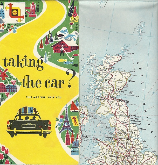
Most Shell country maps of the 1958-61 period use a similar design with stylised images of typical features or landmarks in the area covered by the map. The first example is a 1958 map of Europe which, uniquely, uses a strong purple background. Next is an undated map of Europe, but almost certainly from 1960. Rather than using a multi-lingual design, Shell produced versions of this for different languages: then one above is Dutch, but a French version simply called "europe" is also known. The English version was entitled "Europe: Taking the car?" - there are four known printing variations which all appear to date from 1959 or 1960 - the youngest includes additional motorways, including a fictitious bypass to Wymondham in Norfolk, shown on the errors page. Both Europe maps were designed by Mairs, but the latter is credited to Rotopress. |
 |
In the centre is a typical green country cover, from Sweden (1959) - only the map itself is unusual as Kartografiska Institut chose to produce a 16 page booklet rather than a single sheet.
In many countries, the national maps were supported by city maps of varying designs. Orell Füssli's Zurich map was highly detailed showing every building in the city as well as the locations of the 49 Shell stations. In contrast the anonymous and undated Ghent map was quite basic with no information about Shell garages and most streets unnamed.
 |
Two more of the stylised covers, but each with slight variations. The Turkey map (left) dates from 1960 and has a normal Shell logo and a light blue background: the cover itself is of light card pasted over a locally produced map. My copy has two postage-style stamps on the rear to show local taxes have been paid on the map. The Spain/Portugal (right) dates from 1962, unusually late for the style, and has the later red square logo on it. Foldex prepared this map in France as Shell had no retail outlets in Spain. |
 |
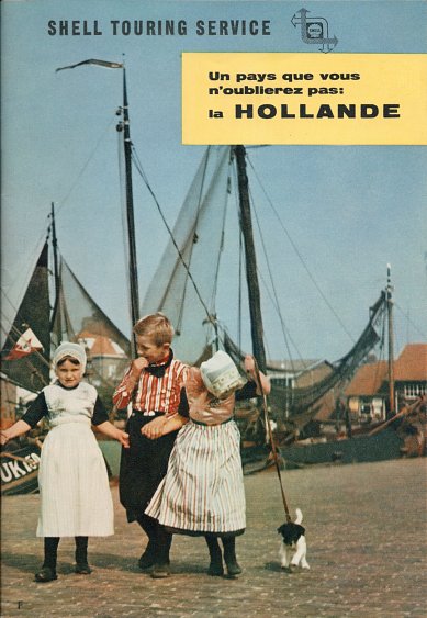
Two touring service brochures of Holland
Shell's touring service offered a less extensive range of brochures in support of their maps than Esso or even BP. However national Shell companies sometimes took advertising space in third party brochures, in exchange for distributing overprinted copies through the touring service. The example on the left dates from around 1960 and is a Dutch Tourist Board 64 page brochure in French, overprinted with the Shell Touring Service name at the top: it contains no road map, but on p51 has a full page ad showing a couple and a Shell attendant poring over a map of Holland.
")
|
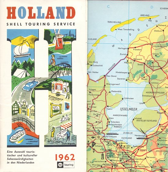
The other example is in German, and the still paper cover unfolds to reveal a fairly basic map of Holland, 400mmx290mm in size. This is a 30 page brochure, with most pages given over to a full colour promotion for a single attraction in Holland, mainly zoos or museums. There is also a double page advert for Shell (again showing a road map being studied at a service station) and for Schipol airport, and the reverse of the fold out map lists hotels & restaurants. |

|
Around 1962, Shell changed the logo again by placing the yellow pecten onto a red square background. Although in some markets - such as Finland - it initially updated old maps by sticking the square Shell logo above the old pecten, it generally took the opportunity to create what are some of the most attractive series of Shell maps in the 1960s...

Text and layout © Ian Byrne, 2000-20
All original copyrights in logos and map extracts and images are acknowledged and images are included on this site for identification purposes only.