TECHNICAL NOTES |
This is an amateur site, but I have tried to make it easy to access from a wide range of computers. Initially it was optimised to not to be too slow to load using a dial-up modem (28.8 or 56K). With the near universality of Broadband, I have relaxed this a little, while still noting that one of my recurring concerns has been to keep file sizes to a minimum without compromising on image quality too much. This page is designed to share my thoughts on how to write a simple yet functional web site, that gives maximum opportunity for the subject to speak for itself.
Icons | Images | Search Facility | Counter/Rating | Browsers | Fonts | HTML Editor
We've moved!Since 7th January 2015, our main web address has been www.petrolmaps.co.uk replacing the old www.ianbyrne.free-online.co.uk address. All subsidiary pages now also start with the www.petrolmaps.co.uk URL, so if you have any favourites bookmarked or links to them, you'll need to update them. The old addresses continued to work for a few weeks (and in most browsers the new ones have actually worked for several years), but unfortunately no longer do so as PlusNet ended the promised forwarding service earlier than agreed. |
Icons
 The icons used on the home page are "home-made". Some are designed to be redolent of particular brands of petrol, although I have not slavishly followed the original sign. Thus introduction looks a bit like Imperial did in the 1980s, Brands may remind you of Burmah (or Uno-X) (and its French equivalent marques inevitably has to use the slightly different colours used by Burmah affiliate Major), Glossary is rather like the sign used by Globe in the period when it was owned by Tenneco, New (and its linguistic variations) are broadly similar to Nafta, Search-Tips is similar to a sign once used by the Munich-based independent Sud-Treibstoff and reproduced here as its former page has now been removed from the site, Special looks a bit like the 1970s/80s SECA sign and Trade-Swaps has a degree of similarity to the old Team Spirit sign. The Technical Notes logo at the top of this page may just remind people of a former Texaco sign. The Top icon, which appears here, is closely modelled on the logo of Trent Oil Products, a Midlands-based company active during the 1930s. (The logo is a child's spinning top, and not a hot air balloon.)
For the direct home page link to UK maps I have ventured further afield, borrowing the style of the logo used by United, a former secondary brand of Marathon-Ashland's Speedway operation. Staying in the USA (or should I say Etats-Unis?) the Cartes de France equivalent link to the summary page of French maps from the French home page is loosely based on the former Illinois brand CF Crystal Flash. In contrast the German equivalent (Deutsche Autokarte) comes from a 1950s German map issued by Deltin. The links from the Dutch home page to Dutch and Belgian maps are both inspired by the old independent brand Trading that operated in both countries. And if I ever get to include a Home icon, then it will undoubtedly have a resemblance to Canada's Home Oil.
The icon that appears in your browser in front of the URL (Mozilla, Firefox and Opera) is called "favicon.ico", and will also be used if you save this site to a list of favourites. It was created online at www.favicon.co.uk which produces a smaller file than the US equivalent site at www.favicon.com, owing to the latter using 256 as opposed to 16 colours. It's not intended to mimic any brand, as it is designed to be a visual aide-memoire about the site.
Images
The earlier map cover images were scanned at 30% of their actual size, using an image resolution of 96dpi (dots per inch).
This allowed an acceptable quality level on screen viewing, although small text or details did not reproduce accurately.
Larger atlases (such as those issued by Esso, Murco or Mobil) are generally scanned at 20%, and in most cases I have noted that they are at a reduced scale.
Later ones were scanned at 100% and 72dpi, then resampled to 30% size using Corel Photo-Paint. This has given much better results, although the resampled images often need to be sharpened before saving. This approach has however given slightly smaller linear dimensions on all later images. Later still, I scanned images at 200dpi, and then successively resampled down, first by 36% (to produce a full size image at 72dpi) and then, as before to 30%.
Where someone has kindly e-mailed me a scanned image of a map in their collection, I have endeavoured to use the same scaling factors, but occasionally I may have under or over-estimated the size of the original map.
Web images use either the JPEG (.jpg) or Compuserve GIF (.gif) formats (or, rarely, PNG). JPEG images are best for photographs as they render them more naturally, generate a smaller file size and have a much wider palette range. GIF images were usable for map covers (or sections of the map itself) that have solid blocks of colours and a more limited palette and simple map covers produced smaller file sizes if GIFs are used. Maps shown using GIFs generally appear sharper and brighter than those with JPEGs. However, since around 2008, all new scanned image files have been saved as JPEGs in order to prpvide greater consistency across the site. I often digitally edit both types before saving to remove blemishes and give an indication of what the map would have looked like when new....
 |
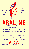
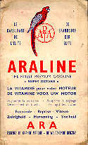
The two images are of the same map taken from a single scan, but clearly show the differences that can be achieved. The GIF image (left) has been re-coloured in a cream that was the closest available match to the original colour of the paper. The JPG image (right) shows the map more as it is today, with water stains from almost 50 years of neglect! The GIF image does show the sharper rendering of text, although the colours are less natural. In this rather extreme example, the GIF file (at 1968 bytes) is less than a quarter of the size of the JPG file (at 9182 bytes). |
 |
The GIF file was also optimised using the GIFBOT minimisation program from NetMechanic.

|
I wrote the above comments before moving to a later version of Corel Photo-Paint (v8). This allows for superior conversion to JPGs, which often results in clearer images than GIF files. In my latest re-working of the file I have also flood filled the discoloured areas of the of the cover with an 88% transparent white several times (the exact number depending on how discoloured a particular area is), to try and achieve a reasonably natural effect. My current scanner setup also produces smaller images and slightly less intense colours than before. |
A technical problem peculiar to a site such as this is that maps produce very poor quality graphics when scanned and saved as JPG or GIF files. In essence scanning a map creates a so-called raster graphic file, and this typically needs to be at least 150-200dpi (dots per inch) to be of a reasonable quality. Maps also demand sharp edges to features such as roads or place names printed on them; JPG images tend to bleed colour from one feature to the next. So if the original map has only a limited colour palette, a GIF file may reproduce it more accurately, but as soon as there are gradations of colour neither format can accurately capture a map extract while keeping a small file size.
Of course native web maps avoid this by using vector graphics; they do not attempt to reproduce a printed map but create a simpler, clearer style.
 At the start of this section I noted that I have latterly produced most image files at two scales - 100% and 30% when viewed at 72dpi. Conscious that most screens are now set to higher resolutions (and bearing in mind that 800 pixels wide was the norm when the site started), the thumbnail images at 30% are beginning to look excessively small. So, after a couple of false starts, from 2014 I have slowly begun adding larger images using Colorbox, a free jQuery add-in that allows for larger images to be overlaid on the screen. On larger screens/smaller maps this will show map covers at actual size; smaller screens or larger maps are constrained to be no more than 95% of the maximum screen height, so will appear at variable scales. Click on the ARA image at left and you should see a larger image. (Incidentally this is a scan of a different copy of the map from those above, with rather fewer water stains!)
Another innovation has been the ability to stitch map images into one large file, and then place them into a frame which can be zoomed in or out. This uses a Microsoft product called Zoom.it (which is also its web address). I will only use this for out of copyright maps (broadly pre-War), and then quite sparingly, as they take a lot of fitting together. But a good early example is the 1930s Standard Luftbildkarte Plan 1 - Zwischen Bodensee und Rhein.
 Search Engine and Counter
From 1999 to 2014, the site search engine was provided by atomz.com (also known for a few years as WebSideStory). This was an excellent and unbeatable product that allowed pages to be tagged as a "target" to appear higher in the search results, and for sections on individual pages to be excluded from the index. The results pages were fully formattable to match the rest of the website, and included customisation features like being able to show the page rankings by using small icons. It was free for sites with under 500 pages that display Google sponsored searches above and below the search results. Users were also able to modify results using wild cards, Boolean logic and restricting searches to image files. Unfortunately the product was withdrawn, with no prior notification to customers, on 31 March 2014, after which I had to do a hurried Google search implementation. Google's image search is possibly better than Atomz's, displaying thumbnail image results, but it is a lot less flexible in how the search box is sized, for example.
There used to be a counter on the Home Page from Linkexchange, later part of Microsoft bCentral which gave the approximate number of visitors since May 1999. By the time this service was discontinued, the Home Page count had reached almost 250,000. And as many visitors use Google or other search engines to arrive at pages other than the home page the total number of page views ran at around 14 times the home page counter number.
All pages are rated using the Internet Content Rating Association's rating system, by the inclusion of coded content information in the page header. Essentially, this states that there is no objectional material of any sort on this website. Although it used to be a good idea to include ratings information, IRCA has also been discontinued, and few search engines take any note of the ratings statements.
Web Address
![]() From 1999-2014, the site primarily used the URL: http://www.ianbyrne.free-online.co.uk which showed its provenance as a site hosted by Free Online - in my opinion, amongst the best of the UK's Internet Service Providers. However, once it became clear that the site was growing and was being visited by a significant number of people, I decided to rent a proper, easy to remember address for it - www.petrolmaps.co.uk. Either address would take you to the index page, although until 2014 the PetrolMaps address uses Web Forwarding - supplied by www.names.co.uk - to do so. From January 2015 I switched to using www.petrolmaps.co.uk, with hosting from Vidahost, initially using an htaccess permanent redirect (HTTP 301) to forward anyone using the old addresses. However this ended earlier than intended, so only the new address now works.
From 1999-2014, the site primarily used the URL: http://www.ianbyrne.free-online.co.uk which showed its provenance as a site hosted by Free Online - in my opinion, amongst the best of the UK's Internet Service Providers. However, once it became clear that the site was growing and was being visited by a significant number of people, I decided to rent a proper, easy to remember address for it - www.petrolmaps.co.uk. Either address would take you to the index page, although until 2014 the PetrolMaps address uses Web Forwarding - supplied by www.names.co.uk - to do so. From January 2015 I switched to using www.petrolmaps.co.uk, with hosting from Vidahost, initially using an htaccess permanent redirect (HTTP 301) to forward anyone using the old addresses. However this ended earlier than intended, so only the new address now works.
Browsers...
I will make no recommendations as to browsers, other than that I currently check new or significantly updated pages in Internet Explorer, Firefox, Chrome, Opera and Safari (for iPad). Some pages are also checked on a mobile phone browser based on Android. Initially, to February 2000, pages on this site were tested (and found to work) with two very old Windows 3.1 browsers - Netscape v1.22 and Internet Explorer 3. Subsequently I continued to test pages on both Internet Explorer (but always using the latest version, owing to security issues with old versions) and Netscape 4.x and Netscape 6.0/7.0, as the two Netscape versions use quite separate "engines", until such time as Firefox effectively replaced Netscape. Not all pages display perfectly on the earlier Netscape version due the way it (doesn't) apply style statements to body text outside a paragraph element. I also tested some pages on a PAL WebTV browser, used in some hotels to provide in-room web access.
The HTML coding I have used avoids browser-specific markups and was slow to implement features such as Javascript that were not initially supported by all browsers. The quiz pages use a basic Javascript and the Jigsaw page used to have a Java applet but now (since late 2014) calls a third party application as increasingly browser security settings associated with the Java Virtual Machine [prevented it from working. The last update of the bottom of most pages has been generated by a simple script since July 2003 as does the Random Page selector on the introduction page. There's one seasonal exception - if there are snowflakes cascading on the front page this is a Javascript implementation from Dynamicdrive, based on Altan's original Hungarian script.
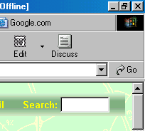
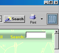
Nevertheless, browsers do still show variances. For example, the navigation bar at the top of this page has been optimised for display in Internet Explorer (the most common browser). To get the Search box to display properly, we need to put the form element inside a paragraph element < p >< form >...< /form >< /p >. However, the closing < /p > causes a line feed in Mozilla (or Netscape or Firefox). However, removing this so it displays well in Mozilla dialects, causes Internet Explorer to do exactly the same thing.
 Internet Explorer |
 Mozilla |
And to make matters worse, Opera treats the display differently again, placing a line feed before the search box, causing it to drop below the line. Whenever there's a line feed, the background image duplicates itself... |
...and fonts
Much of the layout is by way of HTML tables, although this is deprecated, optimised on a PC using the defined in-line fonts of Verdana. Up to the first half of 2002 I used the Windows default font (Times New Roman as it comes out of the box) with the text size set to medium. However, if you had your browser set to Arial as the default font face, you had to set the font size to "smaller" for best results (in IE go to View then Text Size to change these settings). Verdana is used as the primary font as it is a little more legible against the coloured background, and is included with all Windows 95+ or IE 3+ installations. Some pages were already in Arial, and these have been left unchanged for the time being as you can fit a lot more words into a given space on screen. In March 2005, I moved to use cascading style sheets (.css files) for full HTML 4 compatibility replacing internal style statements on each page.
Pages were optimised for a display set to 800 x 600 pixels until the start of 2007. By then, it appeared that as at least 80% of screens were set to a higher resolution (but not always in full screen window mode), as updates were made each page was tweaked to look better in 1024 x 768, the new standard screen size. This may take a long time to permeate throughout the site! However, I have taken care to ensure that all pages still print out fully on European Standard A4 paper - and if formatted tables or images are more than about 640 pixels wide, information gets lost off the edge of the paper. (This is the most common failing of commercial web sites.) For the same reason I have avoided Flash, which does not print out properly most of the time. Flash also tends to result in large file sizes, and is difficult to search.
...and the HTML editor
This last section is quite technical. The pages on this site have been written in a variety of packages:
Simple Text Editor
Many pages were originally written from a basic template blank page and edited in a simple text editor on a Windows 3.1 machine. In practice I have tended to use an early version of MSWorks as the text editor, if only for its superior line wrap, cut & paste and spell checking qualities.
Word
Some of the early pages were written on a borrowed laptop in Word 97. This version of word gave a reasonable "Save as HTML" function, producing easy to write WYSIWYG pages. The main problem was that Word's default inserts image references in capitals; my DOS based operating system regarded them as lower case. This meant that I had to change the case of all image file names before loading them onto the server (which as a UNIX environment is case-sensitive). A lesser problem was that it nested tags incorrectly which sometimes led to unexpected display errors in browsers.
Sadly later versions of Word don't allow you to edit the source code. The reason for this is clear if you look at the code using a text or HTML editor - it is based on the extended markup language (XML) and unintelligible to mere mortals such as I! A second, serious criticism of Word's HTML feature is that the files it produces are very large; for example I saved a simple page recently that came in at over 21K. Re-creating the page in simple HTML code gave a file size of under 5K. As at the time many people still used dial-up accounts, especially in Europe where phone calls are not free, it is unwise to have too large a file size. So I moved to:
HomeSite 1.2
HomeSite 1.2 is (was) a freeware HTML editor, that can (could) be downloaded from the net. Its concept was to permit simple text editing of HTML, with automatic colour-coding and the ability to upgrade all HTML pages in a sub-directory simultaneously. HomeSite has since been sold to Macromedia who have expanded and developed the program, but later abandoned it in favour of Dreamweaver. My early version of the program lacks a spell checker so I need to remember to cut and paste into Word for spell checking before posting to the Web.
My current thoughts on free HTML editors is that the best is probably Coffee Cup, which has a good basic free version, with a slightly more sophisticated paid-for option. However while Windows XP was supported, HomeSite remained my preferred editor, owing to a slightly easier way of spreading changes across all pages.
In my real life, have worked on a number of sites that use content management systems, including WordPress. Unfortunately, it would not be a simple task to migrate this site to WordPress, so for the time being I expect to continue to hard-code it. However, I am aware that the site has been around for almost as long as the public internet and this does mean that it is creaking a little at the seams.
Text and layout © Ian Byrne, 2000-15
All original copyrights in logos and map extracts and images are acknowledged and images are included on this site for identification purposes only.
